The title might lead you to believe I am dissatisfied with Art Instruction Schools’ course, but I assure you that is not the case. XD I have been a student of AIS from 2012 until now, and at no point did I ever consider not recommending it. It is a very good and effective program that offers flexibility in many ways while still teaching you a lot. I think artists of any level can benefit from it.
I started out blogging my progress with every lesson, but trailed off, and now that I’ve finished the course, I thought it would be neat to write a summary post recapping my entire experience. If you’re considering sending in an application, maybe this will help to give you an idea of what to expect. ^^
What is AIS?
In short, Art Instruction Schools (or AIS) is an accredited correspondence art program that you “attend” through the mail. Everything in the course is done traditionally, from pencils to ink nib pen, to paint, and they provide all your materials, as well as sketchbooks for you to practice in.
The course is 27 lessons long, with a five-part portfolio “lesson 28” at the end. It is broken up into four sections, or units, each one focusing on a different area of art.
Read my in-depth explanation here.
How did I enroll?
My brother brought home applications for both of us from his middle school–he wanted to apply as well, but he was too young (you have to be 14 or older) so I applied alone. All you have to do is draw one of their “Draw Me” images shown on the application, fill out the information, and mail it in. You may even receive a scholarship like I did.
I got a phone call from one of their local representatives, answered her questions, and she came by later to view my art in person. She was only interested in seeing my traditional artwork because it better represented my ability to handle physical tools and mediums than my digital artwork (because of layer modes, undo button, resize tools, etc.). I was a little put-off by this at first, but it made sense. Digital art can sometimes be used as a crutch, and she wanted to see my raw, unedited ability.
The actual sign-up was done in-person, where she went over the important stuff with us, like payment plans, policies, and what would be expected of me. Then I got started with Lesson 1!
The Journey
AIS is generally a two-year program, if you do 1-2 lessons a month. However, I took four years to complete it (which is the maximum they allow).
Lesson 1 – Learning to See and Draw
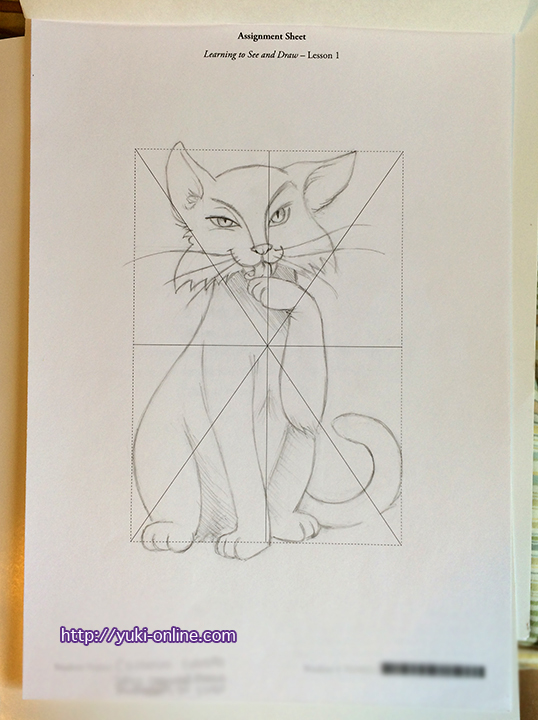
I started out with both Lessons 1 and 2 in hand so that I could already be working on Lesson 2 after I sent off Lesson 1. (This was back when they sent each lesson individually instead of by unit.)
Already I faced the difficulty of having to draw something I didn’t want to draw. Rather, I didn’t want to draw that style or pose. After working on it, getting frustrated, and setting it aside to work on other things, I got a letter in the mail encouraging me to send in the first assignment.
I cried in frustration, and after a pep talk from my mom, managed to finish the assignment and mail it in. I even wrote a letter explaining the difficulty I had, though I don’t remember what I wrote exactly. I’m sure it had something to do with it “not being something I typically draw” or “I keep trying to correct the ‘mistakes’ I see in the original drawing rather than leaving them in”. In reality, I was arrogant and trying to make excuses for what I felt was sub-par work. :/ What I know now is that the “mistakes” I thought I saw were just artistic style, and my work wasn’t sub-par. It was fine XD;
Not long after sending it off, I received my grade, along with Lesson 3. The tail and raised paw should have been filled out more, and the lines smoother.
Lesson 2 – Basic Shapes
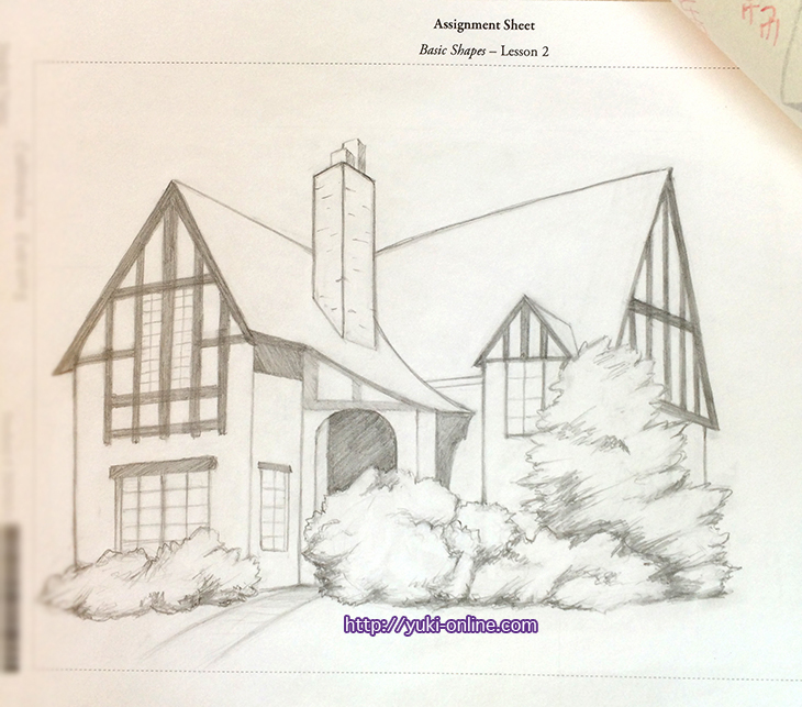
My goal was to finish Lesson 2 before I got another letter in the mail that effectively said, “Hurry up!” but alas, at this point in my life I was very bad about procrastinating. I thought everything was top priority and had to be done at the same time.
After more irritation at the perspective being off (which I was expected to replicate), and things not lining up, and crying again, I finally finished.
When my grade came back, it turned out that I hadn’t needed to fuss over it so much after all.
From this assignment I learned that bushes don’t have to be rendered each leaf at a time.
Lesson 3 – Lines and Measurements
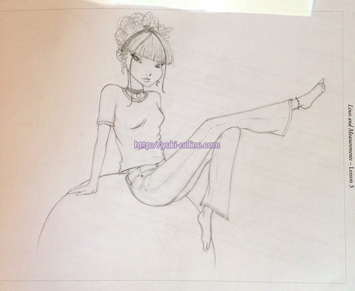
This was a difficult assignment for me again, because of the style of the reference picture. I wanted to draw it using my own style instead. But I didn’t want to get points taken off for doing that, so I drew it pretty similarly to the reference except for the eyes.
When I got the lesson back, I was very glad that there wasn’t a problem with the slight changes I made. They wanted me to work on getting a crisp pencil line by pressing down harder with my pencil, but otherwise gave no critique ;v; Self-critique upon looking at it now, though, would be that the legs are too long XD At that time I was drawing really long limbs!
Lesson 4 – Building a Drawing
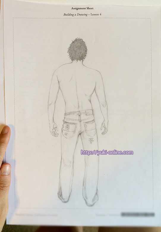
This was a particularly hard assignment in the beginning, because I don’t typically draw realistically. I got upset at the level of detail in the jeans and hands. A lot of these early lessons I remember being incredibly irritated with. XD I cried a lot orz
The critique I received was to fill in his jeans with pencil to indicate they have color to them, and emphasize the folds.
Lesson 5 – Tone and Value
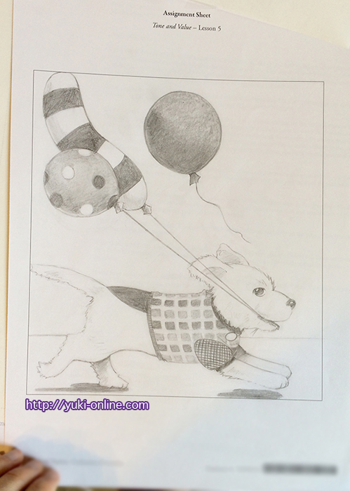
I remember agonizing over this assignment too ;v; It kept not looking like the reference in little ways. I guess sometimes I obsessed too much over copying verbatim in the assignments, so it was really me driving myself nuts rather than the assignment itself XD
They wanted me to make the outline darker.
Lesson 6 – Texture and Pencil Methods
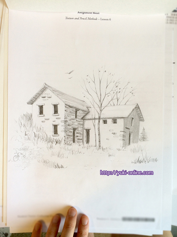
This assignment was easier for me because you’re basically just filling in lineart with shading and various pencil strokes. The critique I got for this was to strengthen my chisel strokes and smooth the branches out more.
From this I learned that details don’t always have to be rendered precisely; those leaves aren’t even attached to the branches in many places, and yet the message is conveyed.
Lesson 7 – 3D Basics and Light Sources
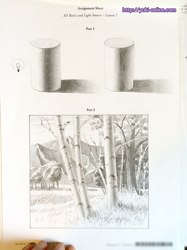
Again, this was filling in existing lines with shading and texture. This lesson was actually revolutionary for me and helped my shading evolve! I was so grateful.
The critique I got for this was to make sure to show three distinct cast shadows on the front trees.
Lesson 8 – Review 1
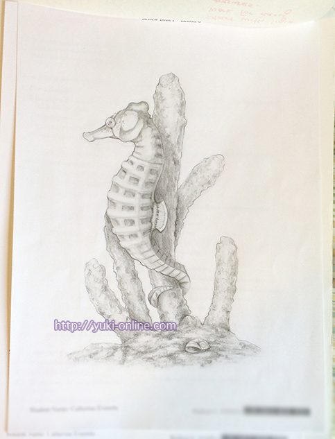
Ahh… The seahorse. I despised this seahorse for a while. ;v; It was agonizing trying to get every little detail perfect (of course, it didn’t have to be, but I didn’t think of that until I was done…as usual orz). The most difficult “easy” part was adding texture by rubbing the paper over another object. It kept not working orz
I was critiqued on the light outlines and lack of texture, and the need for refining the markings more.
Fun fact: I listened to tons of AKB48’s Satou Amina’s podcast while working on this assignment. I found the podcast free on the Japanese iTunes store and thought it looked interesting (and good for Japanese listening practice).
Lesson 9 – Pen and Brush Techniques
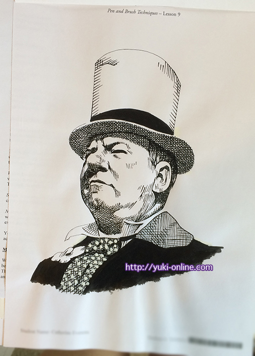
I actually enjoyed this one for some reason? There was a basic lineart that you had to fill in using the techniques from the lesson.
I first tried to do it all with the felt tip marker they provided, but the lines were way too thick, so I redid it using the nib pen. In all, it took me four hours (not including the first attempt or lunch break), in one sitting, to complete, which was a record I don’t think I’ve beaten in completing the rest of the course.
Lesson 10 – Cartooning
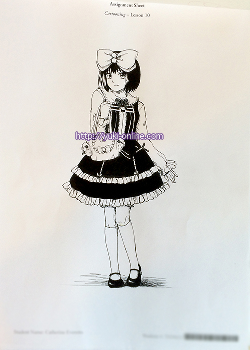
One of my favorite assignments, this time I got to draw something original! I designed a lolita outfit and drew this. The inking was done with the nib pen and ink, and solid fill with the brush and ink (though I may have cheated a bit and used my microns for some of the tiny spaces; I don’t remember XD).
Fun fact: my mom loved the handbag design so much that she insisted we try to make it and sell it. It hasn’t happened yet, but if it does, I will let you know. Design (C) me! Haha.
Lesson 11 – Color Theory
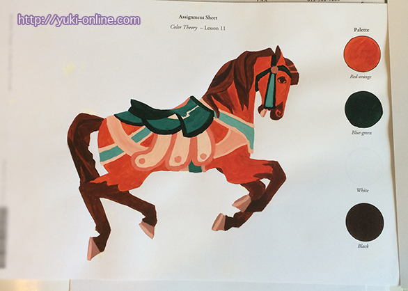
With Lesson 11 my woes with painting began. Painting has never been my forte; I’ve always had trouble with mixing colors and using way too much paint trying to get the right color, and my application tends to be epically thick…
Happily that’s what this assignment called for, so I just sort of sat down and made myself do it. Painting really has to be done in one sitting, otherwise you may not be able to get the same colors when you mix them again. (I say this from experience–and the textbook says it too, just in case you don’t believe me XD)
Lesson 12 – Color Application
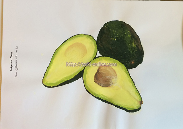
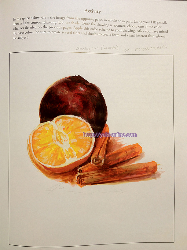
I gained a little bit more confidence in painting with this lesson and assignment. ;v; Plus, I love avocado.
Lesson 13 – Basic Design
I blogged about when it arrived, but talked about the previous lesson (the avocado) instead. XD
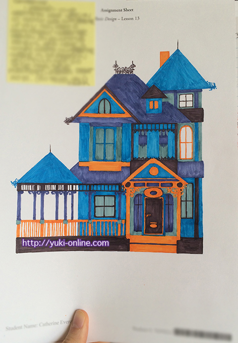
I struggled with this one, but I also enjoyed it. Because this assignment allowed for any medium, I used my Copic markers to color this time instead of paint or something else.
(The note is in response to a letter I had written the school about wanting to go to a manga school in Japan. My teacher [I have three teachers] said that he graded my Lesson 10 assignment and believes I don’t need to go to manga school to make a manga. It was a great encouragement to me, although I know I still have a lot to practice when it comes to actual manga pages. Since I didn’t want to take it off, I just blurred the note to put focus on the art XD)
Lesson 14 – Review 2
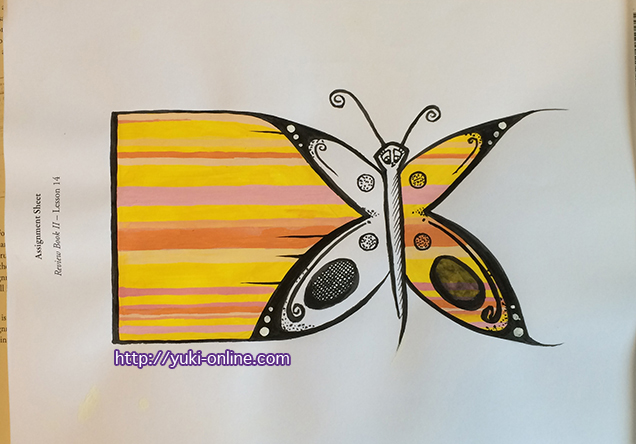
I was an idiot and forgot what a triad color scheme meant. It’s not just three random colors. I was supposed to choose two analogous colors and one complementary color. So the orange should have been blue.
At this point I wrote this post about reaching the halfway point.
AIS has helped me to grow as a person just as much as it has helped me become a better artist. The assignments have provided me with challenges I could not back out of, something which I think was sorely needed. Having no choice but to sit down and do it, even though I would get terribly frustrated with many of the assignments and how “not perfect” my work was and subsequently spend an evening in tears, truly gave me a great appreciation for artists who work primarily in traditional media, and pushed me into being far more proactive in general.
Lesson 15 – Animal Basics
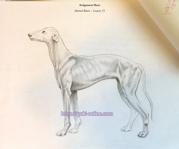
I remember drawing this was incredibly taxing. As usual, I always end up trying to be hyper-accurate… But I think it was warranted this time. The point was to be able to render the structure of the animal’s bone and muscle underneath the skin and fur.
Lesson 16 – Advanced Animal
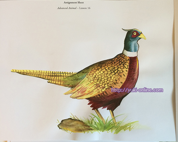
Though I had more confidence with the painting this time, the sketching part was difficult. I ended up drawing it too big, since the tail needed to be longer than what it is. The neck is too long as well. Another critique was that I should have used blue to define the feathers rather than brown-black.
Lesson 17 – Linear Perspective
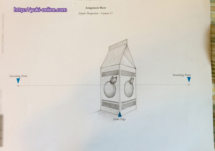
I rather disliked this assignment because it just…wouldn’t cooperate with me.
The teacher recommended to put X’s in circles (i.e. the oranges) to help me align them.
Lesson 18 – Atmospheric Perspective
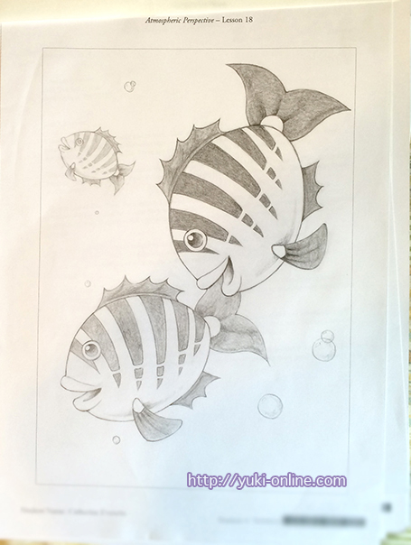
This was one of the assignments I didn’t really enjoy.
My hyper-attention to detail can be seen in the fact that, though I made the fish in the background lighter than the ones in front, I neglected to blur out the details. My logic was that the human eye would do that for you, but by trying to employ that “handicap”, if you will, I wasn’t completely following the directions. (I didn’t realize that at the time though; I was just trying to be accurate by putting the details in lol)
Besides, putting less detail in objects that are further away, it causes the eye to focus on the objects in the foreground that have more detail (and vice versa).
Right at the end, when I was erasing all the leftover lines, the paper crumpled and I got really upset XD; I wrote a letter and included it with the assignment apologizing and explaining the situation. They said a few lessons arrive damaged/scrunched in the mail so it wasn’t an issue XD;
Lesson 19 – Drawing a Still Life
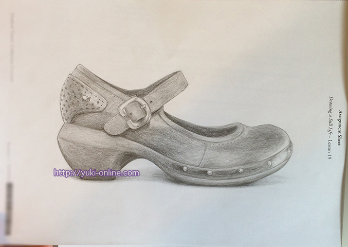
I enjoyed the challenge of this assignment for a change! I had to pick one of my shoes and draw it, something I had done in art class in (I believe) middle school, but this one is of course way better than the one I did in middle school XD
This is a Merrill shoe that I wear with most of my lolita coordinates at conventions!
Lesson 20 – Lettering Basics
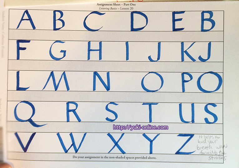
My teacher suggested to hold my breath when making each stroke XD And working/practicing within guide lines.
I hated this part of the assignment; calligraphy is something I’ve never really done before except in messing around, and I liked my freehanded calligraphy better than the specific style I was supposed to mimic, so it made me cross. XD (Also, I went through all of the assignment sheets trying to do it right orz)
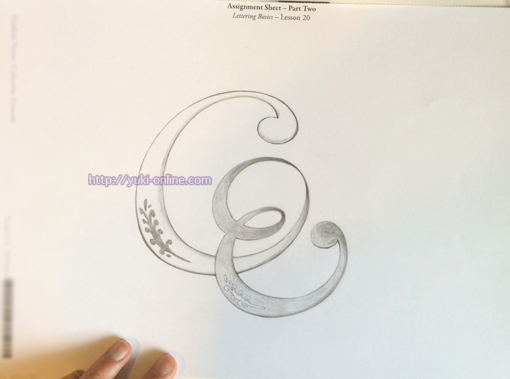
Part two was to create a logo using your initials. I couldn’t think of anything for the longest, so finally I just went with the way I used to sign my art in sixth grade (with added flair and “logoyness” of course).
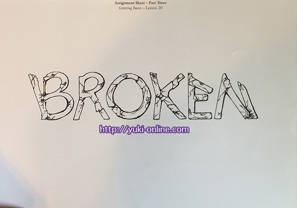
Part Three was a little boring, to be honest, but I tried not to get lazy about the work, lest I make a stupid mistake and ruin everything. In this, you can see that my way of thinking about text was still largely illustrative rather than font-based. It’s fine for very specific things, I guess, but I think that a font like this would be difficult to use, especially since it’s not filled-in with black.
About this same time I got real-world experience in making a logo for my church’s TV program, A New Day. See the logo? It’s not mine. Mine got rejected. I learned a ton from that!
Lesson 21 – Composition
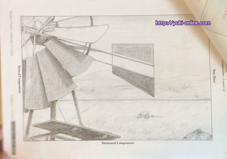
This was another really painful one to do. x.x I was supposed to take parts from three images and put them together into a new composition. The difficulty came in part from the perspective of each object. I tried to compensate, but it still looks bad LOL.
I also wasn’t sure how I wanted to render the background, so it came out looking weak. The critique I got was to put more emphasis on the silo and tractor rather than the windmill.
I only took a photo of Part Three this time, since the other parts were about developing ideas.
Lesson 22 – Review 3
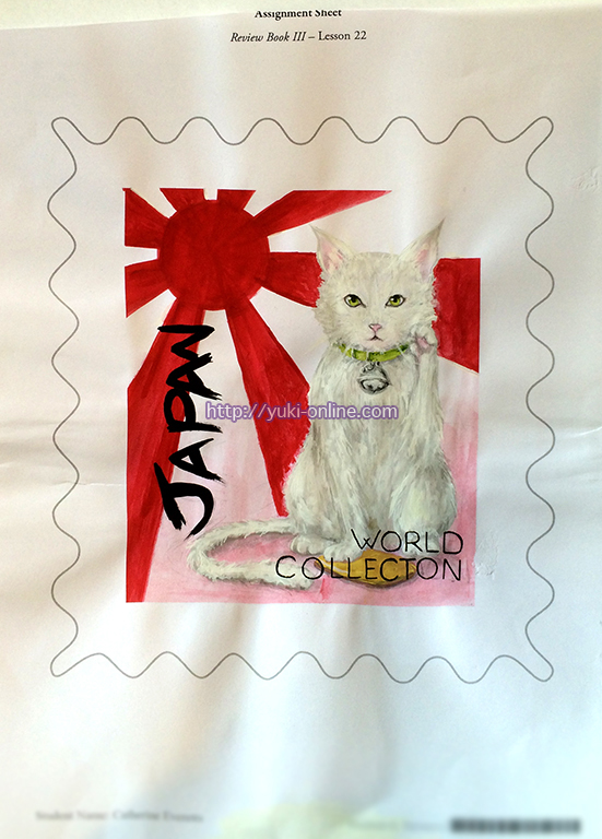
The third review assignment was to design a stamp! I had fun with this one, except for painting the cat. I also, for some bizarre reason, misspelled “collection”, which makes me facepalm even now, since I rarely make such mistakes.
I was also an idiot and didn’t use references for the cat. Had I used a reference, I might have been able to define the raised leg more clearly–which was the critique I got.
Lesson 23 – Drawing the Figure
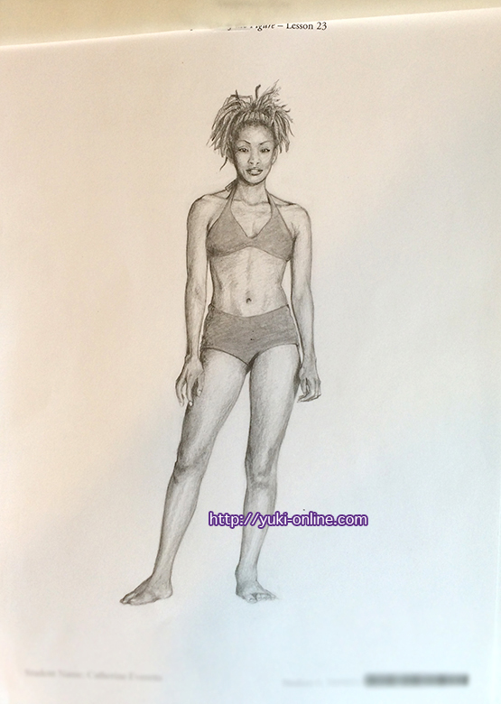
This assignment was excruciating and took two tries (T . T) I feel like it took me the longest out of all the assignments to do, too.
Thankfully, the only critiques I got was to make the toes/feet more curved, and to indicate the surface she’s standing on. (I didn’t because the textbook said not to draw the background, and I figured the surface she’s on is part of the background XD)
Lesson 24 – Foreshortening of the Figure
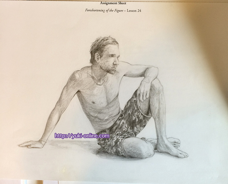
This one made me want to headdesk. Repeatedly. THE PATTERN ON THE SHORTS SADLFJSJDFDLSFJ. Also foreshortening is probably the bane of every artist’s existence. Probably.
I remember being incredibly happy when I finally got each part of this picture to cooperate though QwQ
Personally, I think the shading could still be better and I still don’t like his face or that foot that’s in front. x.x
Lesson 25 – Portrait Studies
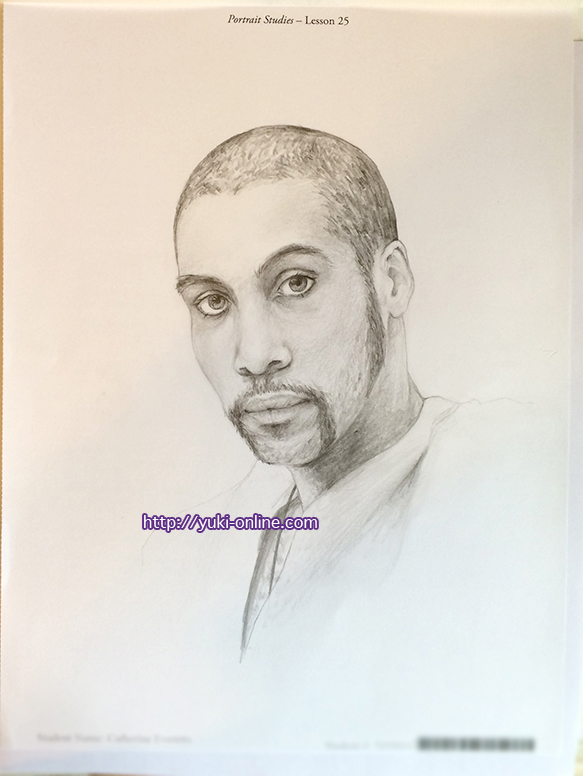
I had a hard time with this as well, but it wasn’t as bad as I thought it would be ;v; I think my struggle with this one came more from being too focused, if that makes sense. I finished it quicker than I expected, but wasn’t totally happy with it.
Critiques I received on this were to shorten his nose bridge and cheeks, and to use swirling/chisel techniques with the pencil to render his hair and such.
Lesson 26 – Fabric, Folds, and the Figure
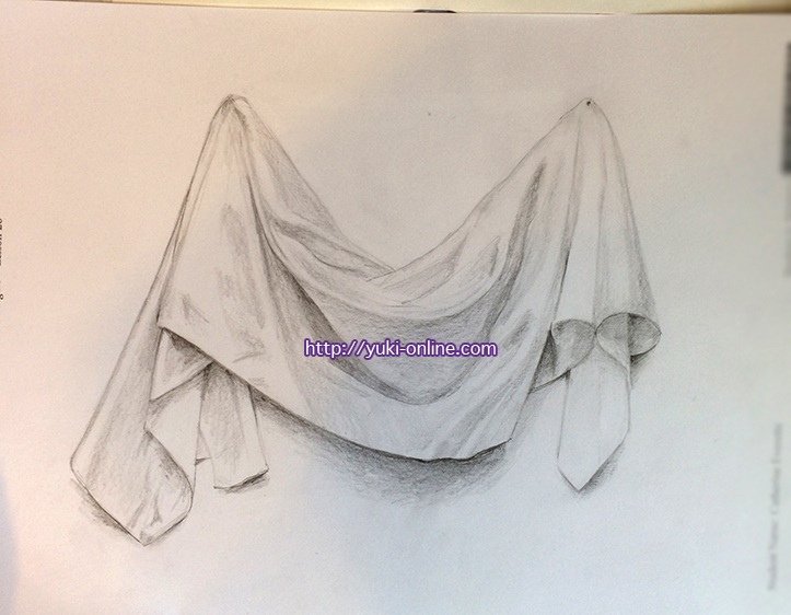
This piece of cloth was easy enough to sketch, but keeping track of all the folds when shading was a much more difficult task orz
I was told to make the contrast greater, and use a fine-point pencil technique to show the texture of the fabric. (Fabric texture is something I need to work on specifically, I think.)
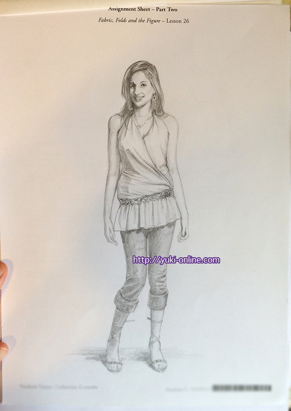
Okay, I may have hated this one the most. I didn’t mind the folds this time; rather, it was the woman’s pose and super-harsh shadows that bothered me. She’s standing too stiffly, and clearly that belt is meant to be worn around the upper middle, not the waist, so it hugs her in the wrong place. (It was likely done on purpose to cause you to practice drawing a specific type of fold.) Some details got nearly lost in shadow and I had to almost make them up.
The critiques I received on this were to straighten the necklace (you’re supposed to improve upon the original photo), and to introduce greater contrast by darkening the shadows more.
From this assignment I learned more about depicting folds using just shadow and not lines.
Lesson 27 – Review 4
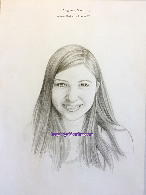
Self-portrait! I tried to take the previous assignment’s critique into account and improved on the photo by taking my hand out of it XD
My mom says I did this one the fastest, but since I literally did not look at the clock the whole time, I have no idea if that’s true or not. I guess it helps that I know what I look like?
Lesson 28 – Portfolio
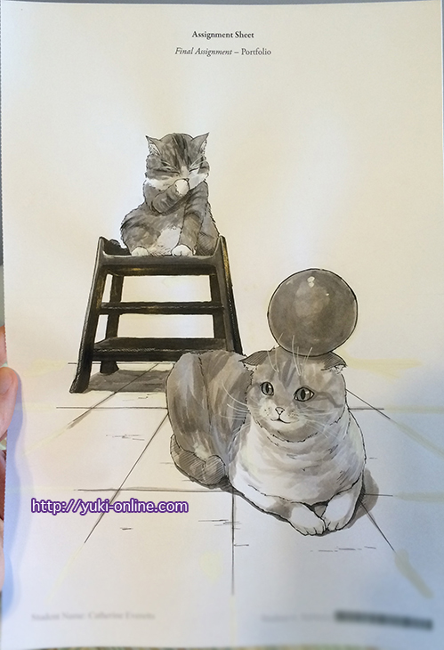
The portfolio is the final step of the course! I redid the sketch so many times and really hated how it was coming out until thanks to God it came out like this suddenly! Noel still doesn’t look that great, but I’m much happier with it than I was ^^
I used ink washes and fill, the nib pen, my micron pen, and Sakura white gel pen.
Please ignore all of the white-outed parts–the white paint that comes with the provided art supplies actually dries kind of yellowish…
References: Maru & Hana blog | Suri Noel YT
I can’t find the Maru pic right away, but it’s in the archives somewhere! Just click the link above and browse to your heart’s content. <3
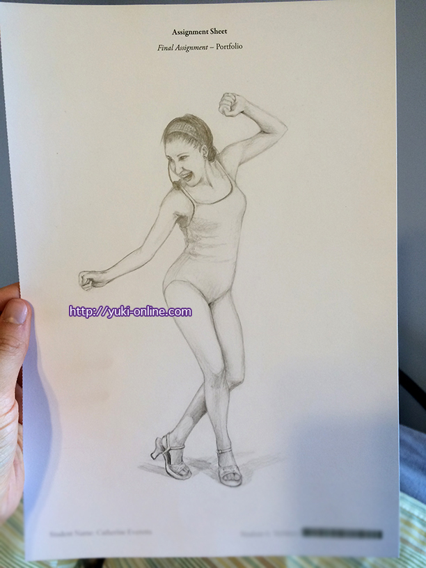
I still don’t like the face. It’s just not as happy-looking as Senshi actually looks in the photo ;A; Also the contrast is probably not great enough…and the lower hand still looks odd.
Reference: SenshiStock on dA
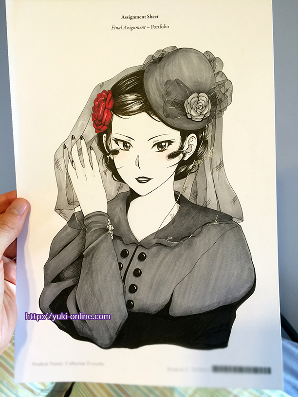
I started this once, didn’t like it, and set it aside. I was going to try again with realism, but decided to just try manga-style again and got this! I used Copics, colored pencils, my white Sakura gel pen, microns, and brush and ink.
Reference: a bunch of Google images
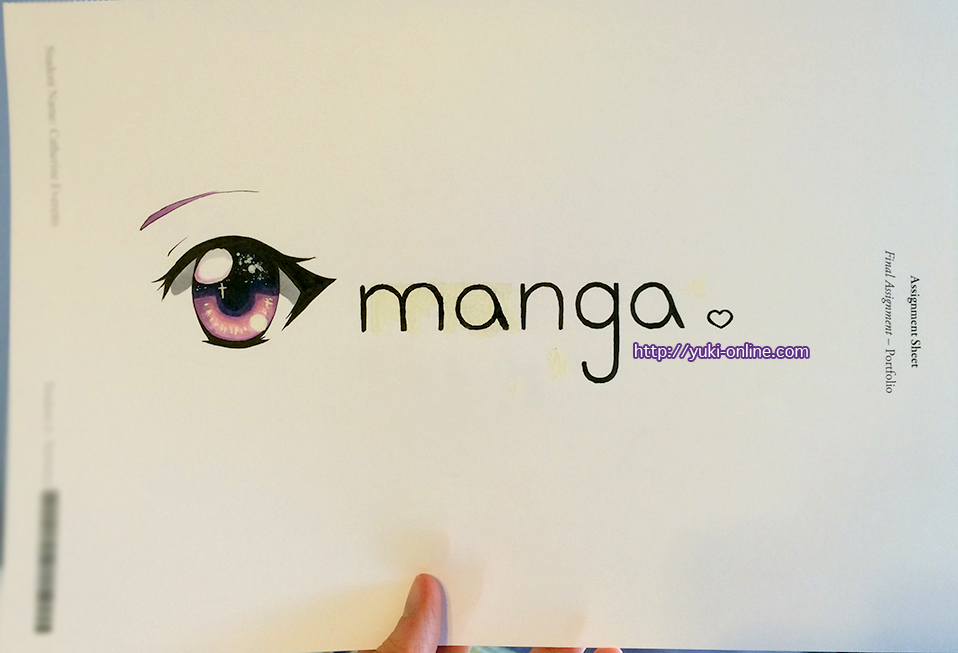
For this part, I had to make a logo that represented the kind of art I do.
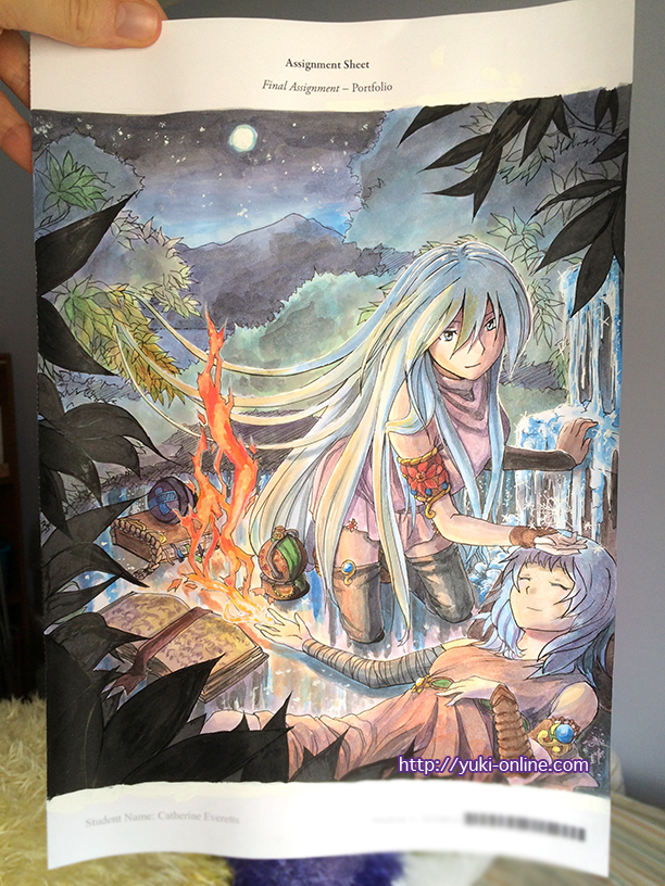
The last part is a free choice! I tried to use the paints they provided, partially to try using them up (of course that didn’t happen) and had some terrible trouble getting it all to cooperate. ;A; I was trying to treat it like watercolor, but sadly it just doesn’t act like watercolor since it dries almost instantly orz It acts like tempera and acrylic, so the best I could do with water-mixing was to apply washes.
When painting with lineart, watercolor is the easiest to use, I think, since as long as you use waterproof ink, you can paint over your lines and not worry about losing them, yet if you don’t dilute the paint, it can layer like other paint. Even so, when you wet it, it will bleed, which is often a good thing in my case since I prefer mixing wet-in-wet.
If I decide to paint something from here on out, it will most likely be done with watercolor. (Here’s an example of a painting I did with watercolor recently vs. this student paint.)
Could I have just used watercolors? Or even Copics like I usually use? Yes, but I wanted to challenge myself and try to use up the student paints. I would say I succeeded in part and failed in part. I’ve learned from it, for sure.
I also gave up with the nib pen close to the beginning since it kept messing up–I think the nib is damaged–so I used my #3 micron instead. I used a Copic once to go over a shadow, and the details in white are my Sakura gel pen. I also used brush and ink, and colored pencil for a tiny part.
I nearly cried at this one as well, and almost scrapped it, but I kept praying to God for help and he got me through it ;w; I still have a ton of personal critique on it, like the leaves and the blotchiness of some of the shadows, and since the black paint kept drying gray due to mixing with water, the overall picture isn’t as dark as it’s supposed to be. The perspective is also a tad off and I’m sure I could have done better with the books and ice.
The characters are Enko and Nariko from my original story ^^ I like to do assignments in series if the opportunity presents itself, so one contest entry I submitted was a comic page taken from an AU story of Enko and friends (placed top 15 but didn’t win); another was Enko with Nariko, fire and ice meeting in the middle (placed 1st!!); and now this portfolio picture. ^^
Final Thoughts
This course has humbled me, pushed me, and challenged me. Were it not for the lessons, I honestly don’t think I would have put myself up to these sorts of challenges. I don’t think I would have improved as quickly, either.
I used to be afraid of drawing new things. I either didn’t want to mess up, thinking I would somehow get in trouble for not doing a character (for example) justice. I used to shy away from that, even going so far as to draw something different from what someone requested just because of “not knowing how” to draw the character.
Now, it might not be easy to draw new things, but I’m not afraid of the idea anymore. Sure, I still have my comfort zone (which has expanded thanks to the course as well), and things I’m better at drawing than other things, but I no longer shy away from drawing a character simply because I haven’t drawn them before.
Painting still isn’t my forte. Using the nib pen still isn’t my specialty. I admire calligraphy and lettering, but still have no desire to pursue it. I would still rather draw in my manga style than realistically. But the difference now is that I know that if I want to, I can.
Thanks to AIS, I was able to make a logo for my dad’s company. I was able to make my own font for the menu that goes with my artbook, Duel Cafe. I was able to attempt a realistic Copic commission of my mom’s coworker’s daughter even before I had gone through the lessons most relevant to it. I was able to brave watercolors to paint that Fallout 4 gift art for my brother instead of falling back to Copics.
I still have tons more growing to do, and a lot to learn, but AIS has helped me grow already in so many ways, both artistically and as a person, and for that I am very grateful.

